Warehouse Receiving Platform Consolidation
One platform. Three workflows. Designed for the real world.
A 2.5-year UX challenge to bring three fragmented receiving applications onto one platform — without forcing very different operational environments into the same experience. I led the UX across mobile, RF gun and automated desktop workflows, from discovery and concept through live warehouse testing and international rollout.
- Role
- Lead Senior UX Designer — manual and automated workflow solutions
- Timeline
- Feb 2023 – May 2024, ongoing design lead since
- Scale
- 30 sites · 13 countries · ~2,700 daily users
- Devices
- Mobile · RF gun · Desktop
Project Overview
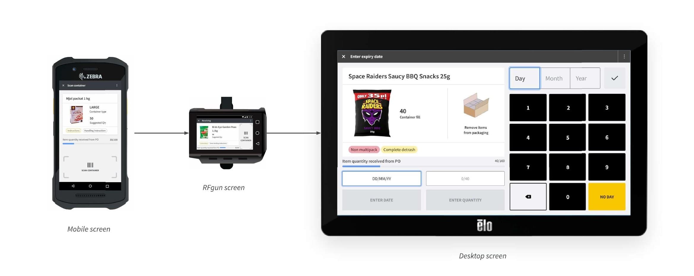
The company was maintaining three separate apps for the same core warehouse receiving task — one for in-store fulfilment (ISF) on mobile, one for freezer operations on an RF gun, one for the decant automation station. Each ran on a different device, served a different workflow (two manual, one fully automated), and was owned by a separate engineering team with its own codebase. The duplication was costing cloud spend, dev resource, and maintenance overhead. The ask: consolidate all three into one platform.
- Duration
- 2.5 yrsDuration
- Sites
- 30Sites
- Countries
- 13Countries
- Daily users
- ~2,700Daily users
My Role & Timeline
- My role
- Lead Senior UX Designer, covering both manual and automated workflow solutions
- Freezer + ISF consolidation
- Feb 2023 – Nov 2023, continuing as design lead for ongoing fixes and feature updates
- Decant automation station
- May 2023 – May 2024, continuing as design lead for ongoing updates
- International rollout
- Sweden / IKEA — Oct 2023 onwards
Collaborators: 40+ engineers across three teams, alongside Product Managers, Engineering Managers, Group Product Managers, Heads of Engineering, Heads of Product, UX Writers, and Health & Safety Specialists.
Discovery & Research
I took on this project shortly after joining the company. To understand the workflow, I went through the existing info pack, then went into the warehouses myself to interview, observe, and shadow workers across all three units.
ISF (mobile) and Freezer (RF gun, −20°C to −26°C)
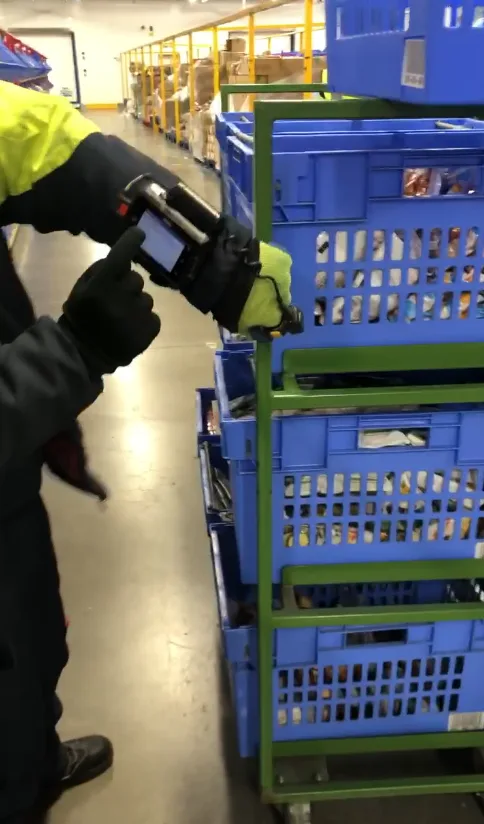
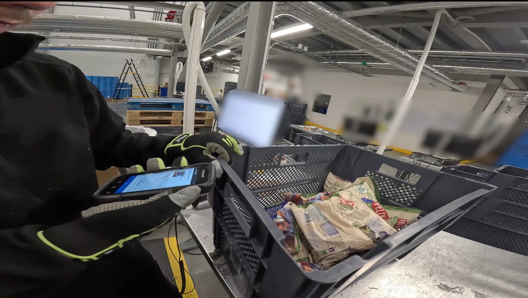
These two units share a similar core workflow but differ sharply in site size and screen interaction. For ISF, constraints were about information density and step order — sequences differed slightly from Freezer for the same task. For Freezer, the real constraints were physical: workers wore bulky gloves in an extreme cold environment, against a screen a third the size of a regular mobile phone's, in landscape rather than ISF's portrait. Buttons that worked fine on mobile were often untappable with gloves — ISF's calendar pickers would become error traps in Freezer.
Simplicity wasn't a nice-to-have here, it was survival — every extra step meant longer exposure to cold.
Decant (desktop, automation)
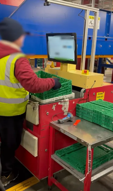
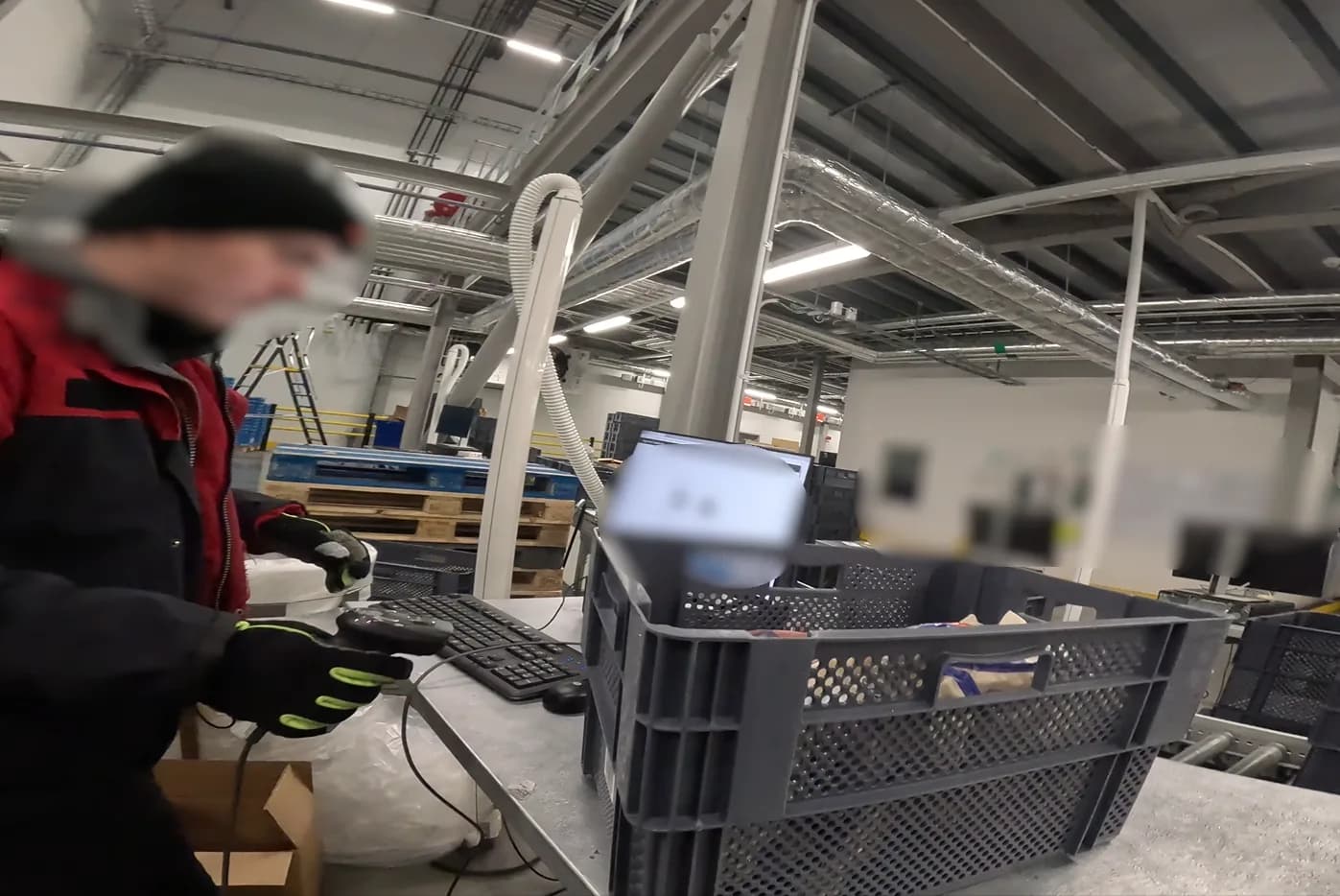
A different world entirely. Workers monitored an automated station, verifying and responding to system events as conveyors moved totes on their own. Their KPI was units per hour, and it mattered more here than in the other two manual units — each product genuinely took longer to process in Decant due to the amount, so a single data entry mistake cost far more to fix.
Define & Ideate
The project started with combining ISF and Freezer — the two manual workflows. After comparing the two in detail, I designed an approach that could work across both device types, marking out exactly where the two workflows diverged in step order. I brought this to both product managers, laying out options for streamlining the two into one shared workflow without disrupting either business unit's daily operations. ISF agreed to adapt their workflow so both units could run on the same one.
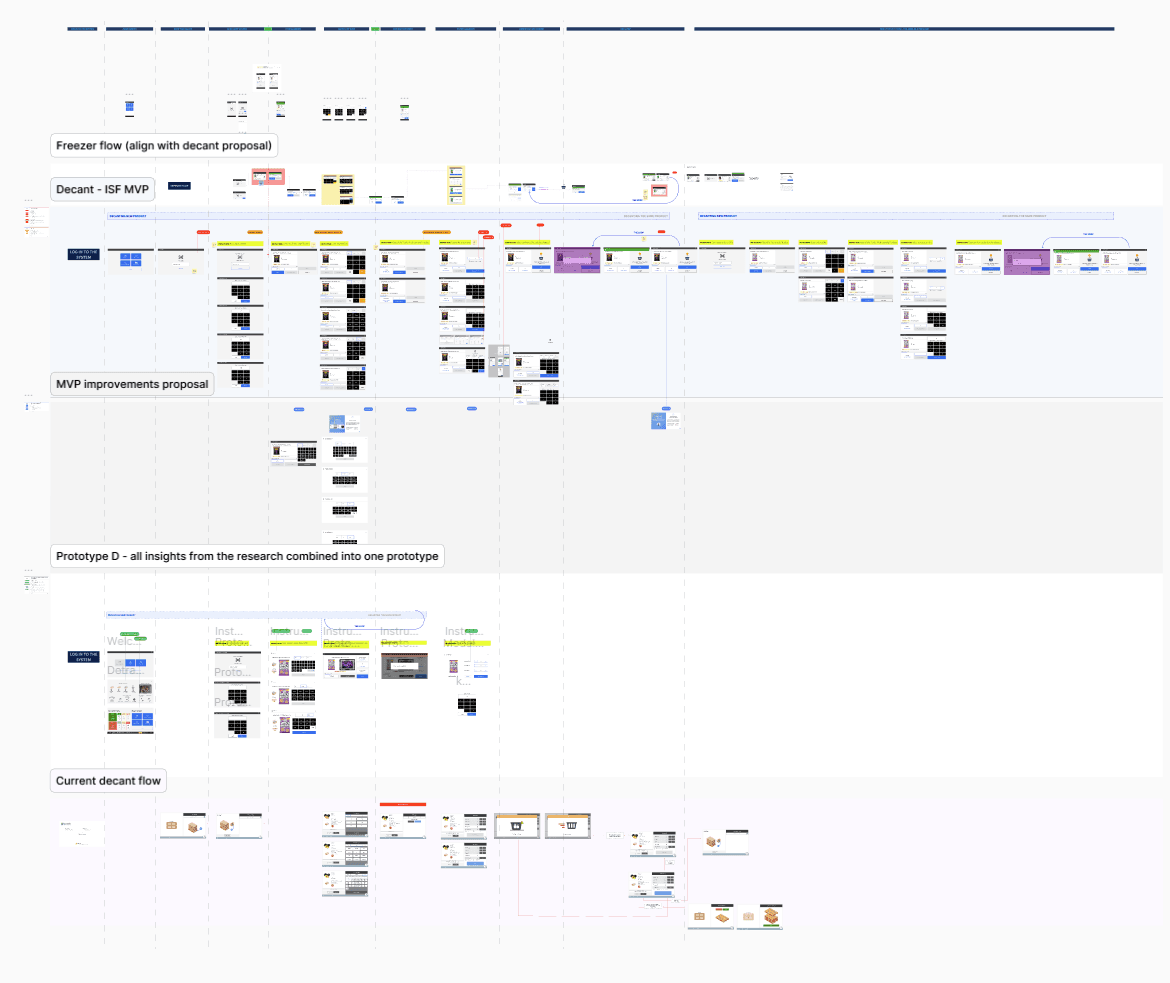
Terminology was resolved the same way: I gathered the UX writers and product managers from both ISF and Freezer to review the differences I catalogued, and got agreement on shared terms across both. Once terminology and workflow were agreed, I handed the work over to engineering to build.
Decant followed separately. Early in discovery, I travelled to Poland for a workshop with the product manager and Decant's designer at the time, to map its entire workflow against what we'd already agreed for Freezer and ISF, and to define MVP scope for the updated workflows.
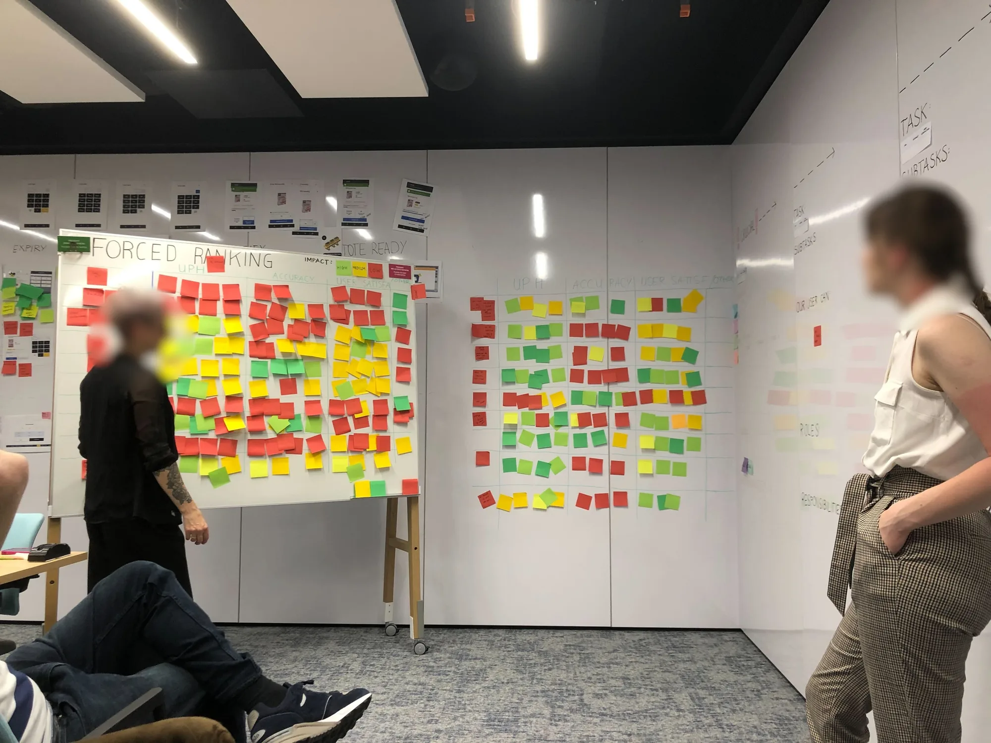
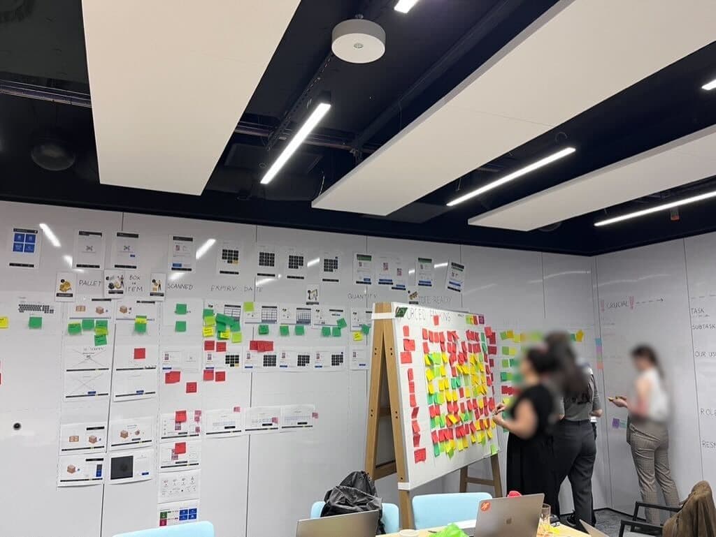
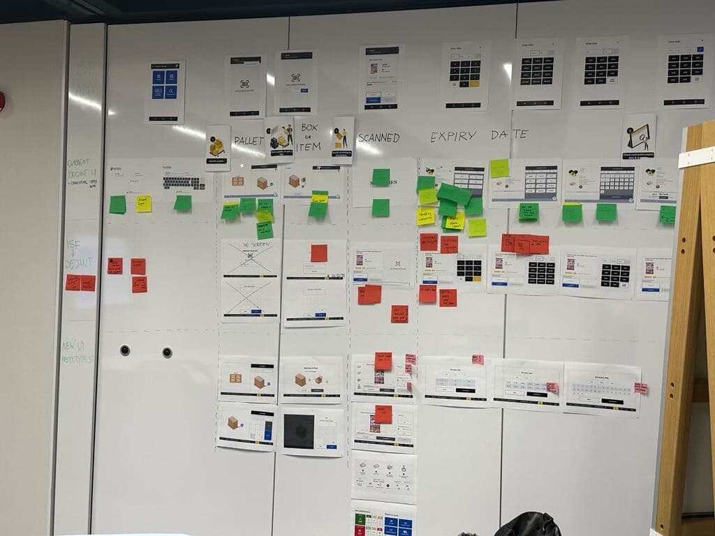
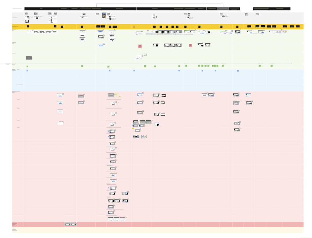
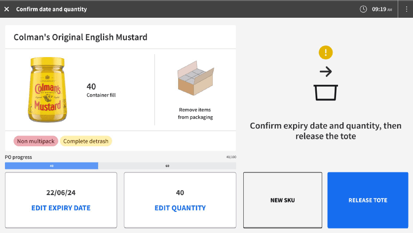
On the device side, this couldn't be one responsive design stretched three ways — each needed its own framework, built on shared components. Mobile became the baseline. For the RF gun, usability for gloved hands at −20°C was the priority in every sizing decision. Desktop had the opposite problem: the priority was keeping product information permanently visible to support accuracy.
Once the happy paths were designed, I moved to exception paths. In Freezer, errors were mostly straightforward data problems. Decant needed far more — a much larger set of hardware-related exception flows, instructing workers how to resolve each issue and reminding them to follow safety guidelines whenever interacting with the station.
Design, Iterate & Final Prototype
Every design change here touched the daily work of thousands of Freezer and Decant workers, so nothing shipped without validation.
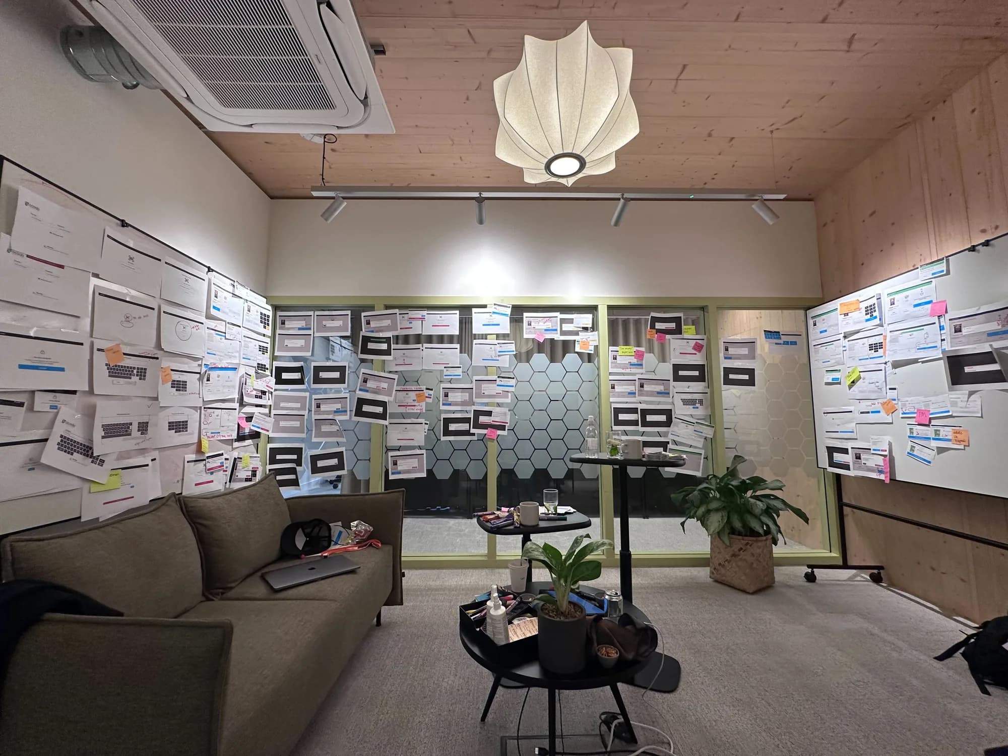
For Decant alone, that meant 70 tests across 7 prototypes and 3 CFCs in the UK — testing for easy adoption, ease of use, and shaving seconds off the existing workflow.
For Freezer workers, I brought interactive prototypes onto the floor and into the freezer itself, walking workers through exactly what would change (the visuals) versus what wouldn't (the core workflow), then gathering their feedback and iterating toward the best outcome.
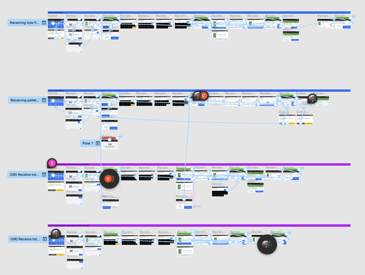
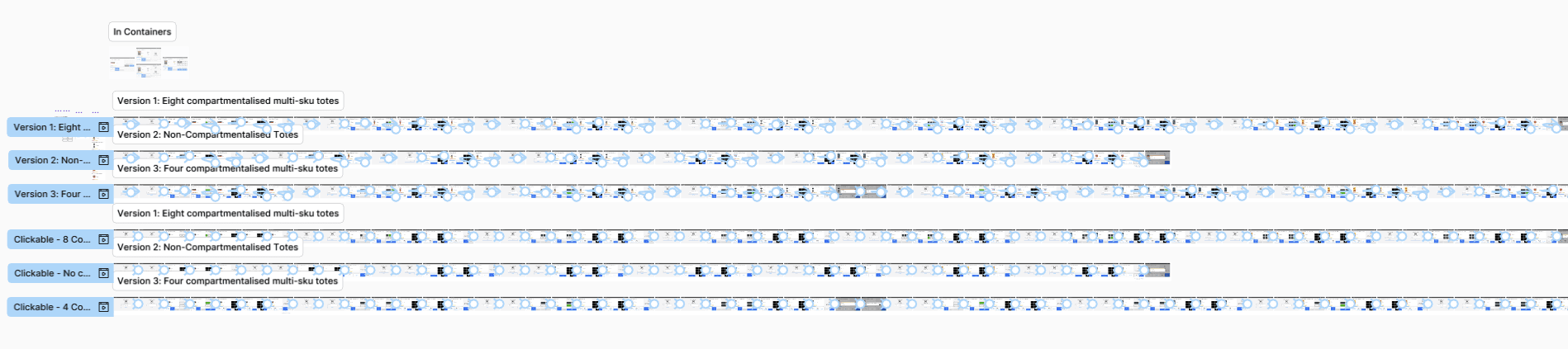
Those site visits shaped how I worked with engineering, too. Being on the ground gave me first-hand evidence and the Freezer workers' perspective — something I could bring back to engineering whenever a trade-off had to be made between Freezer and Decant, and use to make the case for why one needed to be prioritised over the other.
During live station testing for Decant, I spent a few days across different sites observing how users were adapting to the station. This exposed a design-build gap — wrong sizing, modals appearing incorrectly, pop-ups stacking, and more. I documented it all with side-by-side photos and brought engineers and leads into a formal alignment session. Every issue became a JIRA ticket, and the dev team started working through the fixes; we also agreed a post-MVP front-end refactor to optimise the infrastructure and allow more flexible, device-tailored components going forward.
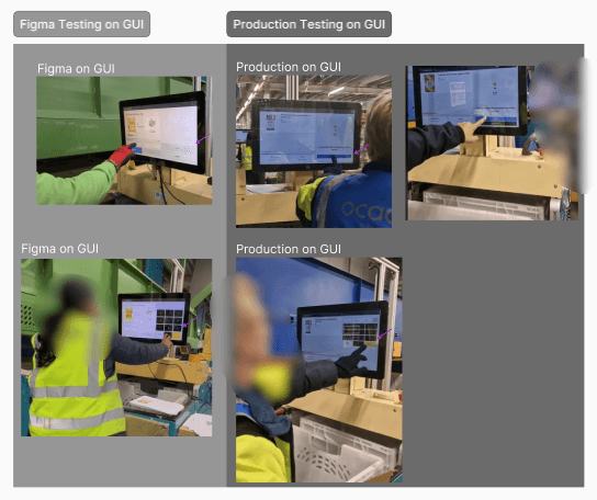
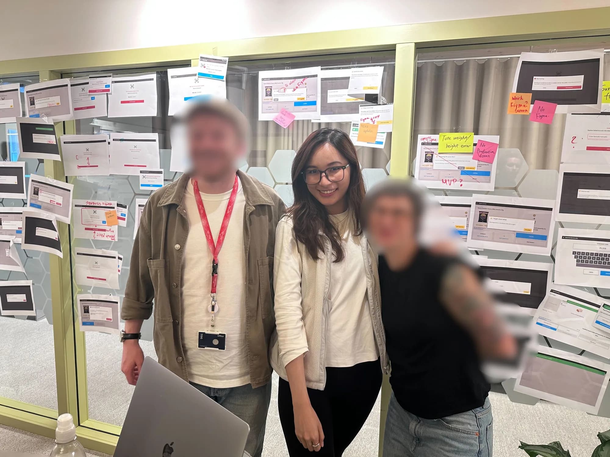
I also helped directly with adoption while on site. A live walkthrough of the dashboard showed it was being significantly underused, simply because workers didn't know what it could do — once shown, the reaction was immediate. That became a lesson that shaped every rollout afterwards: onboarding needed to be built into the deployment process itself, not left to chance.
Deploying to one of our client sites internationally tested the design against assumptions we'd built in from UK operations. I travelled out to see first-hand how the client's teams were actually using the product — running usability testing and interviews on the ground rather than relying on what we'd assumed back home. Workers there used a desktop workstation and a handheld simultaneously, received mixed pallets, and prioritised accuracy over speed — wanting richer on-screen product detail than we'd designed for.
Final Design & Prototype
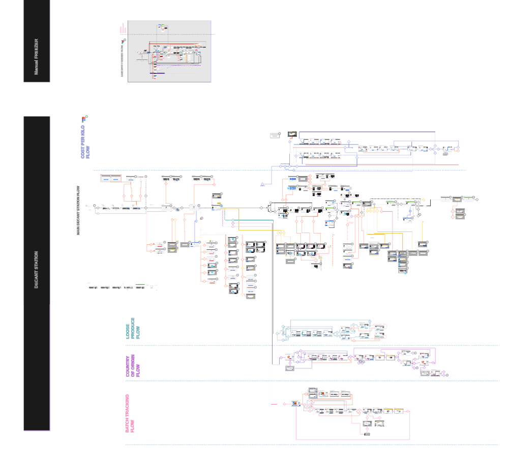
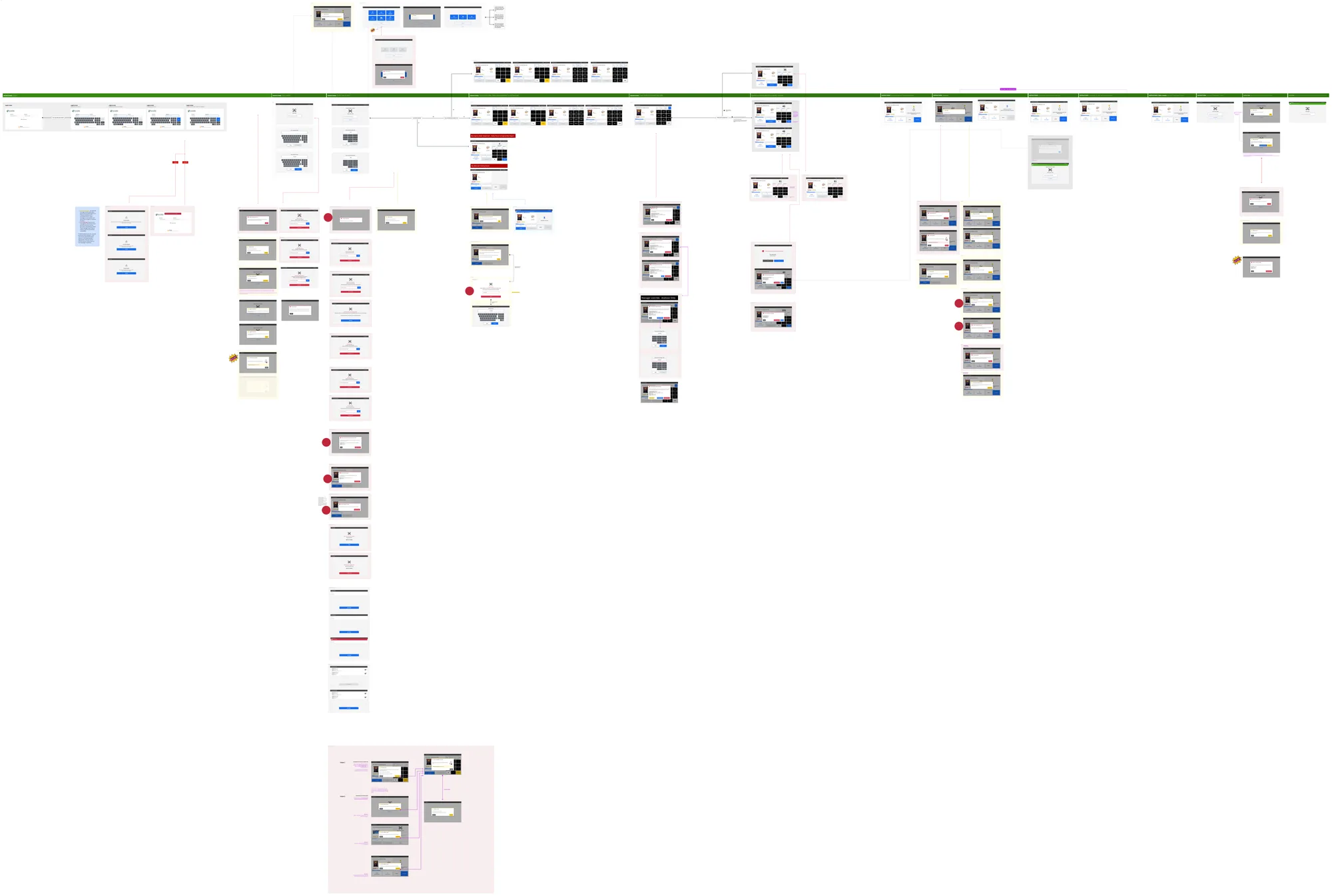
Three interaction models, one shared foundation: ISF streamlined and portrait; Freezer stripped down with oversized touch targets built to survive gloves and −20°C; Decant with persistent product context and safety-first error states.
I validated the freezer design myself, in full PPE, inside the freezer warehouse. Within seconds the cold registers — fingers lose feeling fast. Even in two layers of gloves, I sometimes had to remove one just to tap a single button — something workers did dozens of times a shift under the old design.
That confirmed the principle: never make workers remove their gloves. Bigger targets, fewer steps, higher sensitivity.
Two fixes came directly out of that validation: a flagged routing inefficiency that engineering corrected at the algorithm level, and a built-in timer so managers could track freezer exposure and enforce mandatory breaks — a legal requirement, not an extra.
Sweden/IKEA deployment tested the design against UK assumptions. Workers there used a desktop workstation and a handheld simultaneously, received mixed pallets, and prioritised accuracy over speed — wanting richer on-screen product detail. A live dashboard walkthrough also showed the dashboard was underused simply because workers didn't know what it could do — a sign onboarding needed to be built into every rollout, not left to chance.
Impact & Learning
- Support costs down
- 95%Support costs down
- Labour costs down
- 30%Labour costs down
- Freezer productivity gain
- ~3.5%Freezer productivity gain
- Footprint reduction
- 15–30%Footprint reduction
- Drove measurable operational improvements: consolidating onto one codebase drove measurable cost savings — support costs down 95%, labour costs down 30%, and cloud spend reduced by millions.
- Both automated and manual workflows saw measurable performance gains: Decant improved on speed, error rate, and correctness (validated on-site at each rollout), while the Freezer routing optimisation delivered a ~3.5% productivity gain, ~15–20% reduction in putaway walk duration, 2% increase in pick walk units per hour, and 15–30% footprint reduction — now live across all client sites.
- The unified Decant platform opened the door to technology that wasn't possible on the old fragmented infrastructure — AI cameras, robotic arms for Decant integration, and deeper automation.
Learning
Feature adoption doesn't happen automatically — it needs a deliberate follow-up.
A dashboard I'd designed was sitting significantly underused on an international client site, simply because workers hadn't been shown what it could do. A single live walkthrough changed that instantly — proof that training and support after deployment matter as much as the design itself, especially at scale where you can't rely on word-of-mouth adoption.
Deployment QA matters as much as design QA.
Live testing surfaced cases where what users received didn't match what was validated in prototypes — onboarding and deployment QA now need to be standard on every rollout, not left to chance.
Extreme environments demand first-hand validation.
The glove/cold interaction failure only surfaced because I tested the RF gun myself, in full PPE, inside the freezer — no lab test would have caught it.
Evidence beats argument with engineering.
Side-by-side design-vs-live-station photos turned a dispute into a shared fix list — engineers later said it made them feel like partners, not implementors.
Small interaction costs compound at scale.
Shaving seconds off one Decant interaction seems minor — multiplied across 30 sites and two shifts a day, it's a real efficiency gain. Live usage data and UX testing are what make these calls with confidence.
“Good enough now” beats “perfect later”.
The MVP decision on Decant — shipping a workable consolidation rather than holding out for full parity across all three units — was what let the project move forward without destabilising any team.
Team collaboration is what moves a project like this forward.
Thousands of small prioritisation calls — big feature or small tweak, permanent fix or temporary compromise — and clear communication and documentation at each one is what kept the project on track.
Extending the Platform: a UX-Initiated AI Feature
Spotting the opportunity
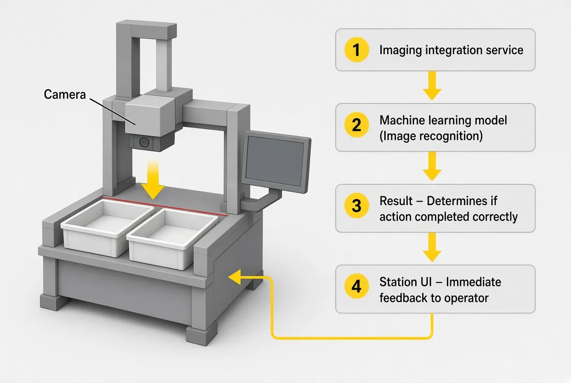
Once the decant application was live and stable, I learned that another team in the business had built an AI vision model — cameras trained on tote movement and robotic picking at the grid. Nobody had connected their work to the decant station, but I saw an immediate fit.
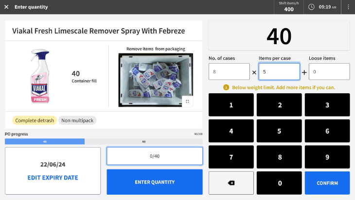
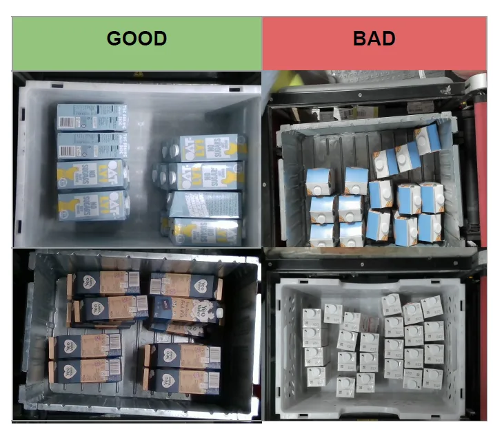
The insight: their model had already identified which product presentations were successfully picked by robotic arms. If we surfaced those proven “ideal state” images to decant operators as visual instructions — showing exactly how a product should look after packaging is removed — we could improve accuracy at the source and give operators far clearer guidance than text alone.
Building the collaboration
I brought the idea to my product manager, then joined the AI team's weekly meetings to understand their model and data before proposing anything. Within two weeks, both teams agreed there was a genuine opportunity, and we kicked off a formal collaboration.
Designing and testing
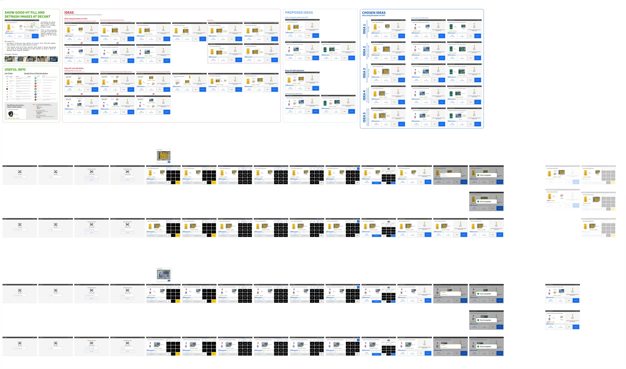
By this point I was mentoring a junior designer, so I briefed her on the project and had her lead the prototyping — exploring how ideal reference images could sit within the existing Decant workflow. I also shaped the testing plan and had her help run it: we tested 4 prototypes with operators in a live warehouse, working together to collect performance data and feedback from the decanters. One concept clearly outperformed the others, in both task results and operator feedback.
Aligning on the details
I worked with the AI team to define image selection rules — which images qualified as “ideal” for detrash, and at what quality, for which products — so both teams were building against the same standard. We then brought in engineering to plan testing scale and rollout.
Outcome
Because this feature originated from UX, product leadership was enthusiastic and added it to the product roadmap. Development was on track until a company reorganisation paused the work — but the project proved something I now carry into everything I do: in a large organisation, the biggest opportunities often sit between teams. By stepping outside my immediate remit, we found a way to reuse existing hardware and a trained model across business units — multiplying the value of work the company had already paid for.